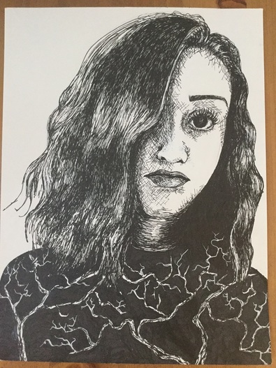
 Here it is. The dreaded self-portrait. For the longest time the words "self-portrait" instilled a little bit of panic in me, so I was not excited to start this project at all. Surprisingly, however, I am super pleased with the way this turned out. It's the first time I've done a self portrait, and also the first time I've done a portrait with pen & ink before, so I definitely learned more about myself as an artist through this piece. But okay, let's talk about pen and ink. I personally love the way pieces done with ink look, and how it gives pieces so much emotion, but they stress. me. out. The hardest thing to get past when working with pen is the fear of messing up. Since you can't erase pen, it can be SO easy to just freak out and never want to use them, but I think that once you get past that fear they can be so fun to work with. I messed up a few times myself during this project, but I used white ink to fix them.
The first challenge I faced right out of the gate with this portrait was getting used to the pens. I hadn't used them since Art 2, so remembering how to shade and get a range of values was really important, especially with faces. I decided to use cross-hatching for the majority of the shading on the face because I liked the sort of raw, sketchy effect they gave. I also had to be really careful where I placed each line, because having one that is out of place could throw the whole piece off. I learned this the hard way when I accidentally extended the shading on the nose a bit too far. This resulted in a super weird, almost disgusted expression. Definitely NOT what I was going for. I went back in with some white ink to cover it up, and I think that helped a ton. Keeping highlights with pen and ink is difficult because you have to know exactly where you want to put your ink, and where to keep it away from. This was especially hard in the eye of my portrait because I have pretty dark, almost black eyes. I did the eye in stages so that I wouldn't accidentally cover up what little light there was in them. I had to be careful with the undereye area as well. I was going for a tired, sort of broody effect with this picture, so I needed some exaggerated shadows under the eyes, but if I added too much it would end up looking like I'd gotten a black eye in a fight or hadn't slept in 5 years. For my body/ shirt, I ran into a little dilemma because in my reference picture it was solid black. I knew I didn't want to make the whole thing black, especially since the body takes up a pretty large section of the piece. I chose to put trees because I really love nature and the outdoors, and I thought that would add something extra to the "self-portrait" theme. I also wanted to do something a little bit more unconventional, since my art tends to be much more literal. Something I want to work on more in my future pieces is thinking more outside the box and trying not to make my pieces so normal, if that makes sense. This whole piece was just a huge balancing act, and I feel really good about how it turned out. I definitely want to keep working on my portrait skills, since I think the ability to draw people realistically is not only a good skill to have as an artist, but something that I personally have a lot of interest in. I also hope to do more pen and ink pieces in the future, because it's one of my favorite mediums.
0 Comments
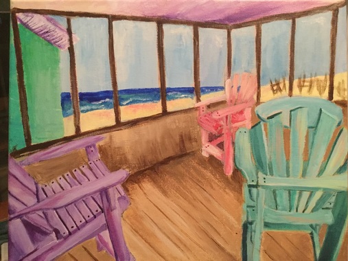 I think it's safe to say that this is the most stressful painting I have ever done in my entire life. After missing four days of school because of being sick I started this project super late, and I had zero clue what I was doing. I had like 4 different ideas, none of which were particularly appealing to me. I found a picture of an old beach house my family and I had stayed in a few years ago, and I thought it was really cool so i figured, why not paint it? It started out okay, I was digging the look of the chairs and I had an idea of what I was doing. Then came the background. I changed the color of the wood in the background so many times (as you can see in my in progress pictures) and NONE of the times I was satisfied with the way it looked. I eventually decided I needed to stop overthinking this painting and just get it done so I could move on. After that I started to hate the painting a little bit less, and I started to see it coming together more. For the most part I'm okay with the way it turned out, but this is definitely not my best work.
The first thing that I think made this process so difficult for me was that I used acrylic paint. As someone who loves to blend, blend, blend, acrylics were a rude awakening for me after using oils. It was like after a few seconds, boom, the paint was dry. It was infuriating. I tried using acrylic retarder, which helped a little, but the drybrush look was unavoidable. I eventually gave up on trying to have a super neat, realistic looking piece, and sort of went for a more abstract, painter-y style. It doesn't feel so much like my work, but I just felt so rushed that I didn't feel like I had another option. There are so many things I would change if I could redo this painting, but I'll name only the main ones. First, I'd use a bigger canvas. 11" by 14" turned out to be way too small in my opinion, but once I had started I didn't want to redo it. I think that if I'd used a larger canvas I might have felt more freedom in my movements and been able to capture more detail, but maybe part of that was my lack of time as well. I might still go back in and add more colors to the wood of the porch, as I feel its still quite boring, but we'll save that for another time. Even though this is not a piece I'm particularly fond of, I still really like the way the chairs in the foreground turned out. I started with those, so I think I was much calmer, and it shows in the way they look. I also like the water in the background, and how abstract I made it, even though you can still tell it's the ocean. I wish I had more positive things to say about this piece, but I know I can definitely learn from this process, which is important. I think my major takeaway from this project is that I am my own worst enemy when it comes to my art. I tend to overthink my pieces when I get stressed, and in the future I need to learn to just take a step back and calm down. Overall, I like this piece and the beachy vibe it gets across, but there is definitely more room for improvement. It's safe to say, however, that I won't be doing another acrylic painting for a while. 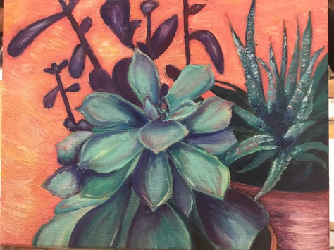 So. This project was an interesting experience for sure. Being my first with oils, I sort of put this unreasonable pressure on myself to do a perfect job and be the next oil painting pro. Like I said, unreasonable. I will say that I think I did a pretty good job with the oils for the first time, but there is definitely room for improvement (as with every project for the rest of my art career). I really enjoyed the oils, maybe even more than acrylic. I liked being able to go back and blend colors the next day without worrying about them drying, but it was sort of hard to get the highlights at first. One issue I found myself running into during this project was keeping the painting from getting muddy. I started to get muddy in the main succulent towards the end, and I had to take a break for a few days to let it dry, so I could eventually go back and re-add the colors more vibrantly. If I were to go back and add something to this piece, I would definitely add some highlights to the plants so they have that trademark "plastic" look of succulents. I might also try to add more to the left side of the painting, since I still feel like it's rather bare.
What I feel like I did successfully with this painting is probably the variety of colors I incorporated. I started out with just greens and blues, and then I started adding in some purples as well. I tried at the beginning to stick to the same scheme of blues and greens, but towards the end I sort of just looked at my palette and said, "let's see how this color looks," and I'm actually really pleased with it. I also wanted to add in some orange/coral colors to the plants since that was the background color, but this made my plants look sort of muddy. I had a mini heart attack at first when I stepped back and saw this, but after waiting a little bit and then retouching it I think it looks ten times better. One thing I'm still not too sure I'm totally pleased with is the background color(s). I feel like the contrasting colors helps make the main focus of my piece (the plants) pop out, but the color is still a little bit unsettling to me. I sort of wish I'd done a more dulled-down pastel color to make it fee less harsh and in your face. As a whole I think this was a pretty good first oil painting. I feel like I will totally be doing more experimenting with oils in the future, and hopefully now that I have a little bit of a clue what I'm doing I'll improve with my next piece. |
A Little InfoThis page is all of my art from Art Four, which I took my junior year of high school. The main goal of this class was to begin collecting pieces that I can potentially add to my AP Portfolio at the end of Senior year. During this class I created some of my favorite pieces, and also one of my least favorite (I'm looking at you, adirondack chair painting). I'll be retaking this class in the fall of senior year to add more pieces to learn and grow even more, and create more potential portfolio pieces. Archives
January 2017
Categories |
 RSS Feed
