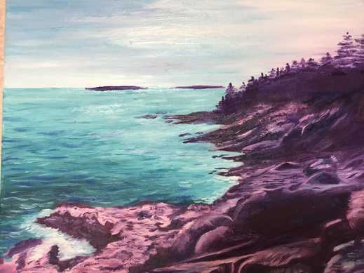
 The last time I painted a landscape was in Art 2, at the start of sophomore year. I had done that one in acrylic paint, and it was actually quite similar to this one. When I showed that piece in critique that year, some of the older students who were in Art 4 at the time told me they would have liked to see how I would have done with oils. I'm here to say that oil paints work MUCH better for landscape paintings, at least in my opinion. It was really cool to see how I could use a different kind of paint for a landscape that had almost the same components (rocks, trees, water). I'm REALLY pleased with the final product of this project. I wasn't sure at first how the landscape would go, since I hadn't done one in a while, but this is one of my favorite paintings I've done in my high school career.
Something I feel like I did really well in this was the use of abnormal/ unnatural colors. Obviously, rocks aren't purple, but I decided to paint them like this. It was mainly because I was being lazy and didn't want to try and paint realistic rocks, but as I painted I began to like the purple rocks a lot. The challenge then became how to sort of incorporate other colors into the rocks so that the piece looked cohesive instead of having this stark difference between the rocks, water and sky. I tried to add some purples into the sky as well. I like how the colors in the sky are very blended and thick, but then the rocks have that sort of impressionistic look. I thought that the contrast of textures I used worked really well. The water is one of my favorite parts of this piece. I like how I captured lots of different values to show reflections of light and different depths. Overall, this project was a huge success (at least I think so). I think it definitely helped me grow as an artist, and show me that I shouldn't knock things because they seem like they'll be too difficult. It also reminded me of how much I like to paint landscapes, and I know that now I'll definitely be experimenting with them more.
2 Comments
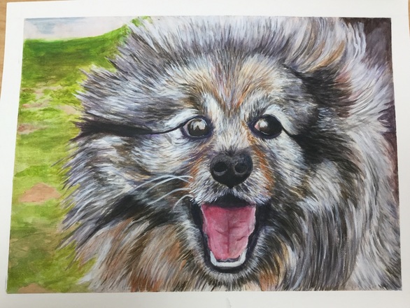 For this pet portrait project I chose to use a method I learned during Art 3... acrylic wash. This method uses lots of really light layers of acrylic paint, and you build them up until eventually you use acrylic paint that hasn't been watered down at all. I used it to paint fur on a cat during Art 3, so I immediately thought of it for the pet portrait project. I started with a burnt sienna wash, since there were a lot of light brown/orange undertones in the photo I was using for reference. I then color blocked the different areas of fur where the colors were a little different, and where some were darker and lighter. After that it was mostly about layering, layering, layering.
For the most part I'm really pleased with the way this turned out, especially the mouth. I did the tongue of the dog last with this piece, and it's probably my favorite part of the painting. I like how I used different values to really capture that classic "happy dog look". I'm really proud of how I captured the emotion of my dog in this painting. I was pretty intimidated at first by the idea of painting a dog with its mouth open, but it was a challenge that definitely worked out for the better in the end. I also really like all the different colors and layers I got in the fur. It's so easy to look at a dog's fur and just see white or black, but when you have to paint fur you have to look for so many colors more than that. I wish I'd had a really really tiny brush to use however, because I still feel like the hair strokes are too thick for the fur. I also would go back and add more lights into the eyes to make the reflections seem less intense. In the reference picture the dog's eyes have little bits of amber and brown in them, so I want to go in and add those into the eyes. I think if I were to do this project again (which I will next year again) I might want to try doing more unrealistic colors because I want to think more outside the box and less realistic. I tend to go more realistic when it comes to my art, and now I'd really like to try new things. It would also be interesting to see the contrast between my work this semester and what I make during senior year and AP Art. But back to the current project, I'm really pleased with the way this turned out. The acrylic wash technique is difficult to do at first, and I'm glad I used it on a second project since it made me a little less afraid to use it. |
A Little InfoThis page is all of my art from Art Four, which I took my junior year of high school. The main goal of this class was to begin collecting pieces that I can potentially add to my AP Portfolio at the end of Senior year. During this class I created some of my favorite pieces, and also one of my least favorite (I'm looking at you, adirondack chair painting). I'll be retaking this class in the fall of senior year to add more pieces to learn and grow even more, and create more potential portfolio pieces. Archives
January 2017
Categories |
 RSS Feed
