|
Having this class was one of the most stressful and yet helpful experiences of my high school career. Granted, it wasn't as stressful as, say, precalculus or biology, but still. I learned that you REALLY have to budget your time or else you will be stuck with a rushed project that you aren't happy with. I learned this firsthand when I had to finish the interior spaces project in one weekend. That on top of using acrylic paints (my least favorite kind) turned out to be my least favorite project of the semester, even year. It was definitely a lesson in time management, but it was incredibly helpful to show me how hard I will need to work next year in AP Art. Having Art 4 twice will definitely help me when I'm putting together a portfolio, and this semester I made some of my favorite pieces. I'm excited to see what new ideas I come up with in the new semester.
One thing I will miss about this class is definitely the people. Having older students who are going into AP Art that can help me with my pieces was so incredibly helpful. The opinions of my peers were often the biggest help in my pieces, I can't tell you how many times I looked across the table at the other girls and asked them to help me if something seems off, or if I can't get a detail right on one of my pieces. It was also really helpful to see how their college application processes went along, and see how they put their portfolios together. It gave me some gauge of what my senior year has in store for me, even if it is a little stressful to think about. I feel like we really became like a close knit family, and that's what I'll miss the most about that class. It's hard to think about a different Art 4/AP class next year without these girls, and I will definitely miss the atmosphere in the room every morning. Art 4 with Mrs. Rossi is a rigorous class, and there is definitely a lot of work, but I feel like I improve as an artist every day. Mrs. Rossi has really helped me learn and grow, and I would not be the artist I am today without these classes I've had with her. I'm excited to see what is in store for me next year, and Mrs. Rossi, sorry in advance for the inevitable late blog posts, and last minute project completions. I can't wait to tackle AP Art next year, and I'm excited to see what I can accomplish.
0 Comments
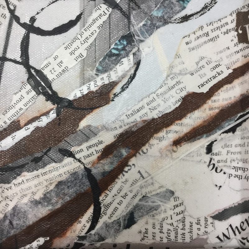
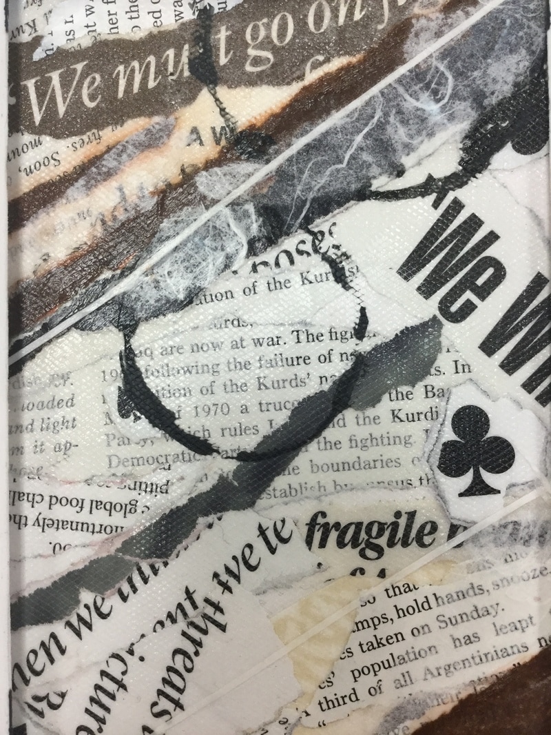
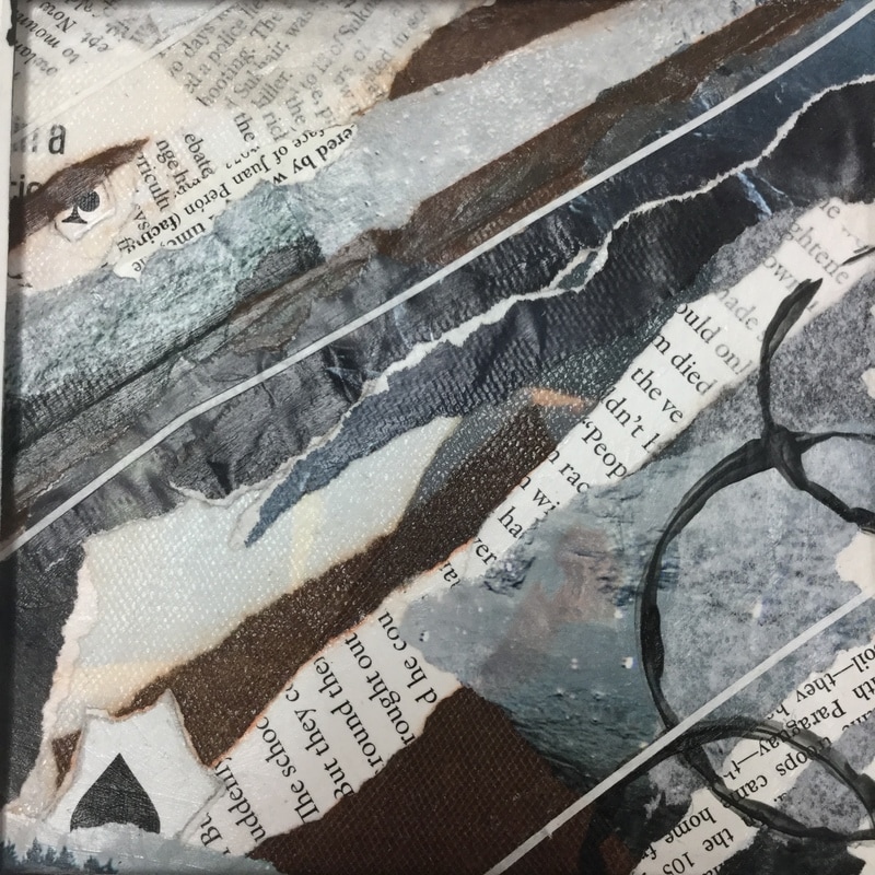
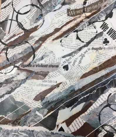 the "zoomed out" version of my mixed media For this mixed media project, I went in with a certain color scheme and overall theme that I wanted to use. As you can see, I chose a lot of neutral tones and natural blues. I wanted to have a sort of natural theme and vibe to my piece. All the photographs I used were of things in nature; some were from underwater pictures, others were of wood, and one was even a picture of lightning (which corresponded to some of the text I used as well). I also wanted to have a certain "flow" to my piece, and really relied on movement. It's pretty obvious, but there is definitely a diagonal flow from left to right. I didn't want it to feel totally random, even though it was a mixed media collage. I had a hard time at first with trying to figure out what to put on this piece, since I'm not used to doing abstract pieces. I also thought of this as more of one big composition, and then I still went through and found smaller ones within that big composition.
The pictures above are three different compositions that i found in my mixed media piece. It's always really cool to me to see what I can find in one abstract piece. I find it really fun to go around with the mats and see what I can find. My favorite of these three compositions is probably the middle one. I really like the variety of textures I used in this section. You can really see contrast in the different text sizes and fonts, which was one of the main things I was trying to incorporate into this piece. In the far left composition, I like the uniformity of the text size and direction. It has a sort of toned down vibe in comparison to the middle piece. I also really liked the colors in this section and how monochromatic they were. The composition on the right I chose because of the colors and movement. This one had elements of the whole piece in it: the tissue paper, text, painted circles, photographs, and even parts of the cards. I really like the way they all came together and made a cohesive mini compostiton.
I liked doing this piece because it was sort of a break from the structured projects I had been doing. It was nice to make an abstract piece of art that didn't necessarily have to have this huge amount of work and time put into it. That being said, it's not like I just threw things on a board, I still had to think about composition and how all my elements fit together, but it was still nice to sort of "let go" a little with my art. 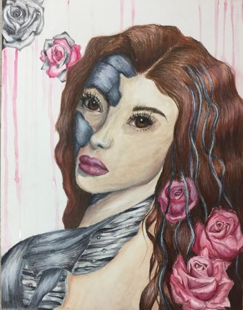 This project was a long process from start to end. I decided to combine the natural beauty of roses with a girl who was partly made of metal. Originally my idea was to do a portrait where the person was made up of clockwork pieces instead of metal, but I didn't really know how I would execute that where it would still look semi good. I didn't realize then that drawing the metal would be so difficult. I only really got it after I'd done the majority of the metal. There are definitely parts of this piece that I like more than others, and some that I would definitely change if I could.
The part of this piece that I think is my favorite is the metal strips on the shoulder and back. This was the last part of the metal that I drew, and I feel like I really captured the shiny, metallic look of the strips. I tried to make them look sort of like muscles, hence why I chose to go with strips. I think this part really emphasizes the mechanical part of the project, and I wish the rest of the metal looked more cohesive with the strips. I also really like the way my roses turned out. I like the contrast between the stark greyness of the metal, and then the soft look of the roses. I wasn't going to add them at first, but I felt like adding flowers would greater contribute to the nature vs mechanical theme. I also feel like they made the piece feel more put together, since they gave me a color to use in the background as well as a color to match the girl's lips. I just find something really comforting about the sort of monochromatic vibe given by all the pinks. Something that really bugs me with this piece is the nose. I know, sort of a weirdly specific thing, but I feel like I messed up big time with the nose shape and shading. If I could go back and erase the watercolor paint, I would definitely want to redo the nose. I also wish I hadn't gone in with prismacolors on the skin and had just stuck to watercolor. I feel like I got the skin tone messed up when I started using prismas. Overall, I feel like this piece was a success. I think this whole process helped me with my problem solving skills, since I had to improvise a little for a good portion of the piece. Even though there are some aspects I'm definitely not completely happy with, the parts that I feel were successful outweigh them. For example, the hair is one of my favorite parts, and I think that takes away from some of the parts I didn't really like that much. I know that my portrait work needs more practice, and this project really helped me learn more about that. I'm excited to see what I can do with them in the future, however. 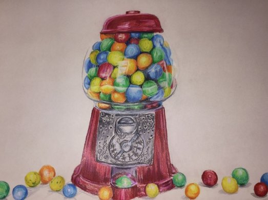 This project was VERY rushed to say the least. I did this over snow days and spent not even a full two days on it before I had to turn it in to the contest. I wish I could have had the full month to work on it, since I feel like it would have turned out more to my liking. For a last minute project I'm pretty pleased with how this turned out. My favorite parts are definitely the top red part and the glass part of the gumball machine. Let me tell you, drawing countless spheres for hours is surprisingly exhausting. The first thing I did after I finished this was take a nap because my eyes were just that tired. I think all my hard work on the glass really paid off in the end, however. I feel like that part actually looks like a realistic gumball machine, and I'm really proud of how I drew the reflectiveness of the glass. The actually "body" of the gumball machine I am not particularly happy with. I feel like the red metal on this part doesn't feel cohesive to the red on top, but that could just be my perfectionism kicking in. I think if I go back and spend a little more time on it I might be able to make it more to my liking, but for now I think it's good enough. And then we get to the metal. I can not draw metal to save my life, and this part was the last part I did on the drawing. AKA, I got lazy. I think I could have definitely worked a little bit more on this part, and that maybe if I'd started out with the metal, I might be more pleased with the outcome. Overall, I think I did pretty well with this assignment. It was definitely good to get some more practice with Prismas, and these colored pencil challenges might be something to try doing next semester when I don't have an art class. As stressful as it was, I think this project will definitley be beneficial to my skills in the long run.
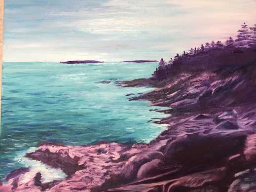 The last time I painted a landscape was in Art 2, at the start of sophomore year. I had done that one in acrylic paint, and it was actually quite similar to this one. When I showed that piece in critique that year, some of the older students who were in Art 4 at the time told me they would have liked to see how I would have done with oils. I'm here to say that oil paints work MUCH better for landscape paintings, at least in my opinion. It was really cool to see how I could use a different kind of paint for a landscape that had almost the same components (rocks, trees, water). I'm REALLY pleased with the final product of this project. I wasn't sure at first how the landscape would go, since I hadn't done one in a while, but this is one of my favorite paintings I've done in my high school career.
Something I feel like I did really well in this was the use of abnormal/ unnatural colors. Obviously, rocks aren't purple, but I decided to paint them like this. It was mainly because I was being lazy and didn't want to try and paint realistic rocks, but as I painted I began to like the purple rocks a lot. The challenge then became how to sort of incorporate other colors into the rocks so that the piece looked cohesive instead of having this stark difference between the rocks, water and sky. I tried to add some purples into the sky as well. I like how the colors in the sky are very blended and thick, but then the rocks have that sort of impressionistic look. I thought that the contrast of textures I used worked really well. The water is one of my favorite parts of this piece. I like how I captured lots of different values to show reflections of light and different depths. Overall, this project was a huge success (at least I think so). I think it definitely helped me grow as an artist, and show me that I shouldn't knock things because they seem like they'll be too difficult. It also reminded me of how much I like to paint landscapes, and I know that now I'll definitely be experimenting with them more. 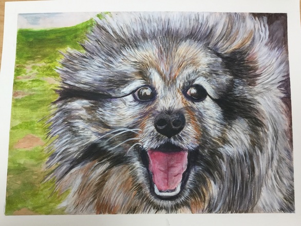 For this pet portrait project I chose to use a method I learned during Art 3... acrylic wash. This method uses lots of really light layers of acrylic paint, and you build them up until eventually you use acrylic paint that hasn't been watered down at all. I used it to paint fur on a cat during Art 3, so I immediately thought of it for the pet portrait project. I started with a burnt sienna wash, since there were a lot of light brown/orange undertones in the photo I was using for reference. I then color blocked the different areas of fur where the colors were a little different, and where some were darker and lighter. After that it was mostly about layering, layering, layering.
For the most part I'm really pleased with the way this turned out, especially the mouth. I did the tongue of the dog last with this piece, and it's probably my favorite part of the painting. I like how I used different values to really capture that classic "happy dog look". I'm really proud of how I captured the emotion of my dog in this painting. I was pretty intimidated at first by the idea of painting a dog with its mouth open, but it was a challenge that definitely worked out for the better in the end. I also really like all the different colors and layers I got in the fur. It's so easy to look at a dog's fur and just see white or black, but when you have to paint fur you have to look for so many colors more than that. I wish I'd had a really really tiny brush to use however, because I still feel like the hair strokes are too thick for the fur. I also would go back and add more lights into the eyes to make the reflections seem less intense. In the reference picture the dog's eyes have little bits of amber and brown in them, so I want to go in and add those into the eyes. I think if I were to do this project again (which I will next year again) I might want to try doing more unrealistic colors because I want to think more outside the box and less realistic. I tend to go more realistic when it comes to my art, and now I'd really like to try new things. It would also be interesting to see the contrast between my work this semester and what I make during senior year and AP Art. But back to the current project, I'm really pleased with the way this turned out. The acrylic wash technique is difficult to do at first, and I'm glad I used it on a second project since it made me a little less afraid to use it. 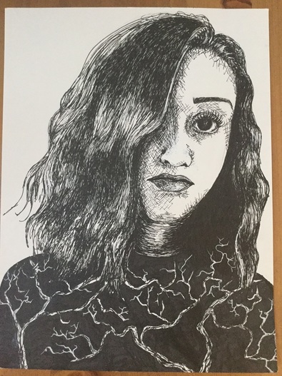 Here it is. The dreaded self-portrait. For the longest time the words "self-portrait" instilled a little bit of panic in me, so I was not excited to start this project at all. Surprisingly, however, I am super pleased with the way this turned out. It's the first time I've done a self portrait, and also the first time I've done a portrait with pen & ink before, so I definitely learned more about myself as an artist through this piece. But okay, let's talk about pen and ink. I personally love the way pieces done with ink look, and how it gives pieces so much emotion, but they stress. me. out. The hardest thing to get past when working with pen is the fear of messing up. Since you can't erase pen, it can be SO easy to just freak out and never want to use them, but I think that once you get past that fear they can be so fun to work with. I messed up a few times myself during this project, but I used white ink to fix them.
The first challenge I faced right out of the gate with this portrait was getting used to the pens. I hadn't used them since Art 2, so remembering how to shade and get a range of values was really important, especially with faces. I decided to use cross-hatching for the majority of the shading on the face because I liked the sort of raw, sketchy effect they gave. I also had to be really careful where I placed each line, because having one that is out of place could throw the whole piece off. I learned this the hard way when I accidentally extended the shading on the nose a bit too far. This resulted in a super weird, almost disgusted expression. Definitely NOT what I was going for. I went back in with some white ink to cover it up, and I think that helped a ton. Keeping highlights with pen and ink is difficult because you have to know exactly where you want to put your ink, and where to keep it away from. This was especially hard in the eye of my portrait because I have pretty dark, almost black eyes. I did the eye in stages so that I wouldn't accidentally cover up what little light there was in them. I had to be careful with the undereye area as well. I was going for a tired, sort of broody effect with this picture, so I needed some exaggerated shadows under the eyes, but if I added too much it would end up looking like I'd gotten a black eye in a fight or hadn't slept in 5 years. For my body/ shirt, I ran into a little dilemma because in my reference picture it was solid black. I knew I didn't want to make the whole thing black, especially since the body takes up a pretty large section of the piece. I chose to put trees because I really love nature and the outdoors, and I thought that would add something extra to the "self-portrait" theme. I also wanted to do something a little bit more unconventional, since my art tends to be much more literal. Something I want to work on more in my future pieces is thinking more outside the box and trying not to make my pieces so normal, if that makes sense. This whole piece was just a huge balancing act, and I feel really good about how it turned out. I definitely want to keep working on my portrait skills, since I think the ability to draw people realistically is not only a good skill to have as an artist, but something that I personally have a lot of interest in. I also hope to do more pen and ink pieces in the future, because it's one of my favorite mediums. 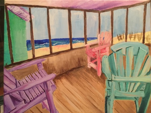 I think it's safe to say that this is the most stressful painting I have ever done in my entire life. After missing four days of school because of being sick I started this project super late, and I had zero clue what I was doing. I had like 4 different ideas, none of which were particularly appealing to me. I found a picture of an old beach house my family and I had stayed in a few years ago, and I thought it was really cool so i figured, why not paint it? It started out okay, I was digging the look of the chairs and I had an idea of what I was doing. Then came the background. I changed the color of the wood in the background so many times (as you can see in my in progress pictures) and NONE of the times I was satisfied with the way it looked. I eventually decided I needed to stop overthinking this painting and just get it done so I could move on. After that I started to hate the painting a little bit less, and I started to see it coming together more. For the most part I'm okay with the way it turned out, but this is definitely not my best work.
The first thing that I think made this process so difficult for me was that I used acrylic paint. As someone who loves to blend, blend, blend, acrylics were a rude awakening for me after using oils. It was like after a few seconds, boom, the paint was dry. It was infuriating. I tried using acrylic retarder, which helped a little, but the drybrush look was unavoidable. I eventually gave up on trying to have a super neat, realistic looking piece, and sort of went for a more abstract, painter-y style. It doesn't feel so much like my work, but I just felt so rushed that I didn't feel like I had another option. There are so many things I would change if I could redo this painting, but I'll name only the main ones. First, I'd use a bigger canvas. 11" by 14" turned out to be way too small in my opinion, but once I had started I didn't want to redo it. I think that if I'd used a larger canvas I might have felt more freedom in my movements and been able to capture more detail, but maybe part of that was my lack of time as well. I might still go back in and add more colors to the wood of the porch, as I feel its still quite boring, but we'll save that for another time. Even though this is not a piece I'm particularly fond of, I still really like the way the chairs in the foreground turned out. I started with those, so I think I was much calmer, and it shows in the way they look. I also like the water in the background, and how abstract I made it, even though you can still tell it's the ocean. I wish I had more positive things to say about this piece, but I know I can definitely learn from this process, which is important. I think my major takeaway from this project is that I am my own worst enemy when it comes to my art. I tend to overthink my pieces when I get stressed, and in the future I need to learn to just take a step back and calm down. Overall, I like this piece and the beachy vibe it gets across, but there is definitely more room for improvement. It's safe to say, however, that I won't be doing another acrylic painting for a while. 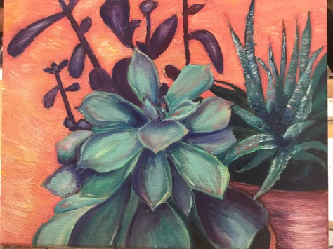 So. This project was an interesting experience for sure. Being my first with oils, I sort of put this unreasonable pressure on myself to do a perfect job and be the next oil painting pro. Like I said, unreasonable. I will say that I think I did a pretty good job with the oils for the first time, but there is definitely room for improvement (as with every project for the rest of my art career). I really enjoyed the oils, maybe even more than acrylic. I liked being able to go back and blend colors the next day without worrying about them drying, but it was sort of hard to get the highlights at first. One issue I found myself running into during this project was keeping the painting from getting muddy. I started to get muddy in the main succulent towards the end, and I had to take a break for a few days to let it dry, so I could eventually go back and re-add the colors more vibrantly. If I were to go back and add something to this piece, I would definitely add some highlights to the plants so they have that trademark "plastic" look of succulents. I might also try to add more to the left side of the painting, since I still feel like it's rather bare.
What I feel like I did successfully with this painting is probably the variety of colors I incorporated. I started out with just greens and blues, and then I started adding in some purples as well. I tried at the beginning to stick to the same scheme of blues and greens, but towards the end I sort of just looked at my palette and said, "let's see how this color looks," and I'm actually really pleased with it. I also wanted to add in some orange/coral colors to the plants since that was the background color, but this made my plants look sort of muddy. I had a mini heart attack at first when I stepped back and saw this, but after waiting a little bit and then retouching it I think it looks ten times better. One thing I'm still not too sure I'm totally pleased with is the background color(s). I feel like the contrasting colors helps make the main focus of my piece (the plants) pop out, but the color is still a little bit unsettling to me. I sort of wish I'd done a more dulled-down pastel color to make it fee less harsh and in your face. As a whole I think this was a pretty good first oil painting. I feel like I will totally be doing more experimenting with oils in the future, and hopefully now that I have a little bit of a clue what I'm doing I'll improve with my next piece. |
A Little InfoThis page is all of my art from Art Four, which I took my junior year of high school. The main goal of this class was to begin collecting pieces that I can potentially add to my AP Portfolio at the end of Senior year. During this class I created some of my favorite pieces, and also one of my least favorite (I'm looking at you, adirondack chair painting). I'll be retaking this class in the fall of senior year to add more pieces to learn and grow even more, and create more potential portfolio pieces. Archives
January 2017
Categories |
 RSS Feed
