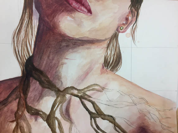
 I love watercolor because they go so quick and look so interesting when you're done with them. I absolutely love the way the watercolor has made this piece look. The little splotches of color here and there create a really interesting movement, and definitely have a different look from my other pieces. I also really like how the composition of this piece is different from most of the other things I've done. I originally didn't want to do a piece at this angle, but the time crunch paired with my idea actually made this weird angle work really well. So, the idea behind this piece is being overwhelmed and feeling trapped in all of the things going on in your life. This piece definitely is more personal to me because I am pretty much constantly stressed out, and I get overwhelmed super easily. Anxiety and being overwhelmed is something that can absolutely hinder and hold you back from doing things that you want to do, so I wanted to use a part of nature that is known for holding things in place: roots. I love the way roots intertwine together and create these really beautiful linear patterns, so I knew that I wanted to use them in one of my pieces. Having them come across the body of this portrait shows the idea of being trapped inside of something, whether it's literally the tree roots on her body or the idea of being trapped within your own mind. Again, I have no idea if that is what people will get out of this piece, but it's what I was feeling while I was creating it.
I said before how much I love watercolor portraits, and that definitely rings true here. The emotional quality of watercolors is so different from that of other mediums, so I think it paired really nicely with this piece and the metaphor it represents. I still do feel like this piece is missing something, and even though I know it's unfinished, I think I'll still end up adding more detail to the roots with colored pencil to really pull out the roots. Since it's my last piece of the quarter, I've been really reflecting on this piece and the old ones I've done. I'm really proud of what I've done so far this semester, and I think a simple watercolor piece like this was the perfect way to end the quarter and give me a break from the complicated and detailed pieces I've done before this. I think now I'm really prepared to go into the new quarter with a clear head an knock out some really good pieces.
0 Comments
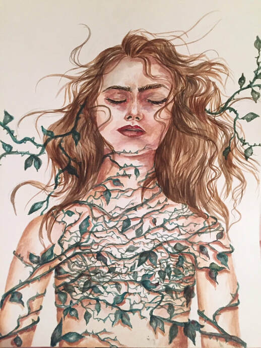 SO. A while back in art 4, I did a piece very similar to this in pen and ink, but we don't talk about her. I loved the idea of the piece and the way it looked, but the face and hair was something that I absolutely hated. I also wanted it to fit into my concentration visually, and the black and white just wasn't what I imagined for the piece. At first, I was really worried about the way it was turning out in watercolor, but I knew there was no other way I could get a piece done quickly by the time it was due, so I kept at it. I like the way it looks now way more, and I'm so glad I forced myself to keep working on it. The idea behind this piece is how we tend to close ourselves off from people, experiences, etc. when we get hurt or go through something hard. In nature, roses use thorns to protect themselves from predators, so I wanted to use thorny vines as something to represent shutting yourself off from the world, so to speak. I also wanted the torso to be totally flat and empty to represent the feeling of emptiness after something bad happens to you, and I think the weirdness of how flat the chest is really makes this piece interesting and draws your eye in.
In terms of technique, this piece is definitely far from over. The hair is going to need some help, and I think I'll go in with prismacolor later on to really add some new details and dimension to this piece. I like the emotion and color I've used in the face, but I will definitely go in and refine the darks and lights more once the hair is finished to really bring out that emotion. I can already say that I like this piece way more than the first one I did like this, and I love the way the watercolors create a different kind of texture and movement. I think watercolors definitely add a distinct emotional value to a piece, and I think they were totally the right medium for this piece. Overall, I know this isn't my best piece ever, and there are areas that are still gonna need some TLC, but for a quick piece I'm actually really pleased with this turnout. And when I look at this one versus the one I was basing it off of from last semester (feel free to check it out under Art 4, but I wouldn't recommend), I can really see the improvement in my work. I think the composition is more interesting with the wild hair, I think there is a totally different emotion to it, and I think it is overall a way stronger piece. I can't wait to see how it turns out when it's finished for real. (UPDATE: This is the final picture, the text above was written before the piece was actually finished) 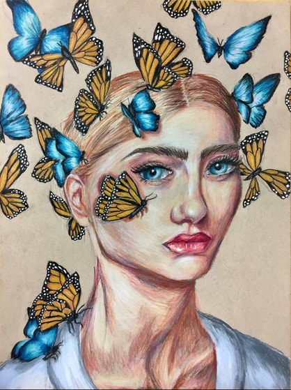 The idea behind this piece is the symbolism of butterflies for change and "metamorphosis." I titled it "for the better," because to me, butterflies show hope for things to improve and a change for the better. I think for a lot of people, change is really scary and is something that is avoided, but with this piece I really wanted to show the idea of positive change. I wanted the woman in this piece to be very serious and strong because it would not only highlight the brightness of the butterflies in contrast to her expression, but to show how you can come out of bad experiences or hard times better off than you were before. I have honestly no idea if that is what people will get from this piece, but it's where my head was at when I was creating it, and I can genuinely say that this is one of my all-time favorite pieces I've done.
I think there's a trend that the portraits I love the most have the best noses. Just hear me out. I hate drawing noses with a PASSION, and I honestly think that getting the nose right makes the portraits look so much better. I spent so much time trying to get the different features of this portrait to look right, and I think that that's why I end up loving them more than the others; I can always see the time and energy I put into them coming to life. There's something really captivating about this woman's expression, and I think a huge part of why I like this piece is because you are so drawn in to it. A friend of mine in my class recommended that I make some of the butterflies blue like her eyes, and I think it made a huge difference. It makes the eyes look almost electric, and then the color discord with the orange butterflies really makes the piece more interesting. I love this piece so much, and considering it took me the least time of my concentration pieces so far, I'm pretty proud of it too. 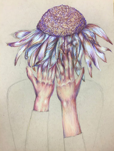 I genuinely cannot look at this piece without thinking of the demogorgon from stranger things. I think it's something about the flower as the head that just reminds me of it, but for whatever reason that's what this piece makes me think of. That is not, however, what I intend for the piece to be about. I wanted this to be a metaphor for despair or just simply feelings of sadness. I think wilted flowers are such a strong image, and I was trying to use that image to show the feeling of defeat when nothing really seems to go the way you want it to. I think that the wilted daisy paired with the hands in front of the "face" definitely create an emotional feeling. I'm not 100% sure yet what I want to do for the body of this person, because I sort of really like the way it looks as just one solid, flat shape. I don't want to just leave it as the brown paper, though, so I guess we'll have to see what color I end up making the shirt.
I don't know why I keep drawing portraits with hands in them, honestly. I hate drawing hands, but it seems like I'm consistently involving hands in my pieces. That being said, I actually really like the way this piece turned out. The hand on the left is definitely a little wonky, but the one on the right is actually really good, in my opinion. I love the colors I put into the skin tone, and how they are kind of monotonous with the colors in the flower. I feel like it really makes the piece feel cohesive, something I really enjoy in my art. I also really like the different textures I used in this piece. The hands are smooth, while the petals are kind of all over the place, and then the center of the flower is very busy and textural. I think it creates an interesting look to the piece, and really draws your eye in. Overall, I'm really proud of how this piece is coming along, and I'm sure that it's going to be one of my favorite pieces yet. 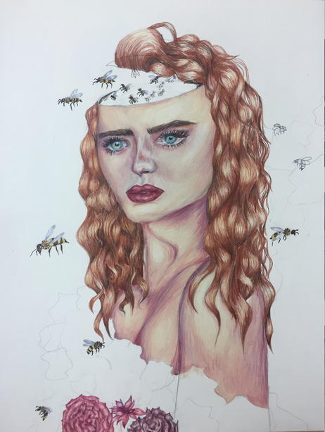 This piece is what I like to call "tastefully unfinished." Don't get me wrong, I want nothing more than to finish this piece, but I think for now I need a little break from it. It's fitting, I think, that this piece is about overthinking, and I overthink every piece of my art ever. I wanted the bees to represent all of the thoughts that "buzz" around in your head. I definitely want to add in some more bees and finish coloring the head to really emphasize the fact that there are millions of thoughts going around at once. I love this piece, and I love the idea behind it. I can't wait to see what will happen once I finally finish it.
Technique wise, I'm super proud of this piece. It's the biggest prismacolor piece I think I've ever done in my life, at 16x20 inches. After painting most of my previous pieces, using prismacolor was a nice change in my life. It was nice to be able to work without worrying about the paint taking a million years to dry. I forgot how much fun prismacolors are to use, and how satisfying it is to blend all of the different colors into one another. I also feel like I rarely do drawn portraits anymore, and I'm super impressed with myself in how this piece came out, at least in regards to the face. I think the hair could use some work to make it look more realistic, as it doesn't look exactly how I imagined it coming out. I wanted it to look more messy and less styled, but I think that might just be something I have to work on and practice more. Overall, this piece has helped show me that I want to be exploring more mediums in my concentration, and I'm excited to see where my next few pieces will end up. 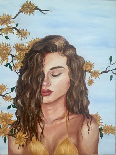 I'm not going to write much about this piece because I've already done it!! (Check it out under Art 4 Part 2). I will say, however, that I maintain that this is the best portrait I've ever done. I am so proud of how this turned out, and I think I will be for a really long time. Pretty much everything about this piece was a new experience for me with oil paint, and I am still so impressed with myself for how well it turned out. I think that this is probably going to be one of the six pieces I send in to the AP graders as one of my "quality pieces," because I honestly believe its one of the best I've done technically. In terms of my concentration, I knew I wanted to include this piece because I love how serene it feels with the yellow flowers surrounding the woman's body. I'd like to eventually add more flowers to really show that she's totally encapsulated in these flower and to further emphasize the feeling of safety I wanted to get across in the piece, but even as it is now, I'm so thrilled with this piece, and I think it fits into my concentration really nicely.
|
Archives
May 2018
Categories |
 RSS Feed
