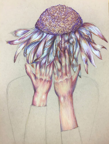
 I genuinely cannot look at this piece without thinking of the demogorgon from stranger things. I think it's something about the flower as the head that just reminds me of it, but for whatever reason that's what this piece makes me think of. That is not, however, what I intend for the piece to be about. I wanted this to be a metaphor for despair or just simply feelings of sadness. I think wilted flowers are such a strong image, and I was trying to use that image to show the feeling of defeat when nothing really seems to go the way you want it to. I think that the wilted daisy paired with the hands in front of the "face" definitely create an emotional feeling. I'm not 100% sure yet what I want to do for the body of this person, because I sort of really like the way it looks as just one solid, flat shape. I don't want to just leave it as the brown paper, though, so I guess we'll have to see what color I end up making the shirt.
I don't know why I keep drawing portraits with hands in them, honestly. I hate drawing hands, but it seems like I'm consistently involving hands in my pieces. That being said, I actually really like the way this piece turned out. The hand on the left is definitely a little wonky, but the one on the right is actually really good, in my opinion. I love the colors I put into the skin tone, and how they are kind of monotonous with the colors in the flower. I feel like it really makes the piece feel cohesive, something I really enjoy in my art. I also really like the different textures I used in this piece. The hands are smooth, while the petals are kind of all over the place, and then the center of the flower is very busy and textural. I think it creates an interesting look to the piece, and really draws your eye in. Overall, I'm really proud of how this piece is coming along, and I'm sure that it's going to be one of my favorite pieces yet. 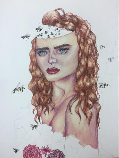 This piece is what I like to call "tastefully unfinished." Don't get me wrong, I want nothing more than to finish this piece, but I think for now I need a little break from it. It's fitting, I think, that this piece is about overthinking, and I overthink every piece of my art ever. I wanted the bees to represent all of the thoughts that "buzz" around in your head. I definitely want to add in some more bees and finish coloring the head to really emphasize the fact that there are millions of thoughts going around at once. I love this piece, and I love the idea behind it. I can't wait to see what will happen once I finally finish it.
Technique wise, I'm super proud of this piece. It's the biggest prismacolor piece I think I've ever done in my life, at 16x20 inches. After painting most of my previous pieces, using prismacolor was a nice change in my life. It was nice to be able to work without worrying about the paint taking a million years to dry. I forgot how much fun prismacolors are to use, and how satisfying it is to blend all of the different colors into one another. I also feel like I rarely do drawn portraits anymore, and I'm super impressed with myself in how this piece came out, at least in regards to the face. I think the hair could use some work to make it look more realistic, as it doesn't look exactly how I imagined it coming out. I wanted it to look more messy and less styled, but I think that might just be something I have to work on and practice more. Overall, this piece has helped show me that I want to be exploring more mediums in my concentration, and I'm excited to see where my next few pieces will end up. 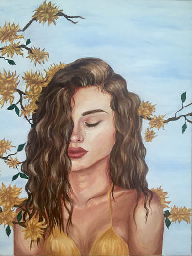 I'm not going to write much about this piece because I've already done it!! (Check it out under Art 4 Part 2). I will say, however, that I maintain that this is the best portrait I've ever done. I am so proud of how this turned out, and I think I will be for a really long time. Pretty much everything about this piece was a new experience for me with oil paint, and I am still so impressed with myself for how well it turned out. I think that this is probably going to be one of the six pieces I send in to the AP graders as one of my "quality pieces," because I honestly believe its one of the best I've done technically. In terms of my concentration, I knew I wanted to include this piece because I love how serene it feels with the yellow flowers surrounding the woman's body. I'd like to eventually add more flowers to really show that she's totally encapsulated in these flower and to further emphasize the feeling of safety I wanted to get across in the piece, but even as it is now, I'm so thrilled with this piece, and I think it fits into my concentration really nicely.
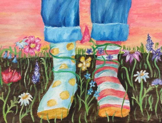 There's this book from when I was a kid called, If You're Afraid of the Dark, Remember the Night Rainbow. It's honestly one of the most beautifully written and illustrated children's books I've seen, and one of the pages has a quote that I've always wanted to make into art. It reads, "If you find your socks don't match... stand in a flowerbed." That line got me thinking, and I decided to make this piece. The person is standing in a field of wildflowers wearing socks that are obviously mismatched. Some of the flowers are wrapped around the ankles, and even though the ground appears to be all dirt, there are little bits of grass popping up around. If you couldn't guess already, these are symbolic. The plants wrapped around the ankles are meant to show nature trying to keep the person from leaving, or changing, in a way. For a lot of people, change can be seen as something really scary, and the idea of staying in one place is comforting and makes them feel safe. The fact that the socks are mismatched represents the "rebellion" of the wearer, and how even if they may want change, the plants are determined to keep them safe and in the same place. I think that the fact that the grass appears to be growing anew from the barren ground shows the idea of renewal and, like the last piece, healing. I think there are different ways to look at this piece. Maybe for some, it has a deep meaning, and the different aspects are symbols for greater things. Maybe to someone else, its just someone wearing mismatched socks in a flowerbed. Who knows.
This piece marked my very reluctant return to acrylic paint. I am, mostly, morally opposed to acrylic paint. It drys so fast and is hard to blend and work with. When you have to do a piece in just a few days, however, it can prove to be your best friend. That was how I looked at it, at least. I actually didn't hate using acrylic again, and it was reassuring to me that not all of my experiences with acrylic have to be terrible. Learning how to appreciate acrylic again was definitely a positive of this experience, but more than that, I just had fun with the piece. It was simultaneously very high-stress (due to the time crunch) and kind of therapeutic. It wasn't a full portrait, or even a portrait at all, so there were no crazy proportion errors to think about, and painting the different wildflowers was really fun. I enjoyed knowing that it is possible for me to get a piece done quickly and still like the outcome. I do think, of course, there is lots of room for improvement, but there always is. It's not the cleanest piece I've ever done, and it could definitely be a lot more realistic, but the colors are really pretty, and I actually feel really happy when I look at it. I guess that's all I can really hope for with a piece that was done with so little time and so much pressure. Okay disclaimer, normally I take in-progress pictures after each day of working on a piece. This one, however, I did in the span of one-day. I tried to remember to take pictures, but I was pretty bad at it. With that being said, here are my five in-progress pictures from this piece. (Sorry Rossi!) 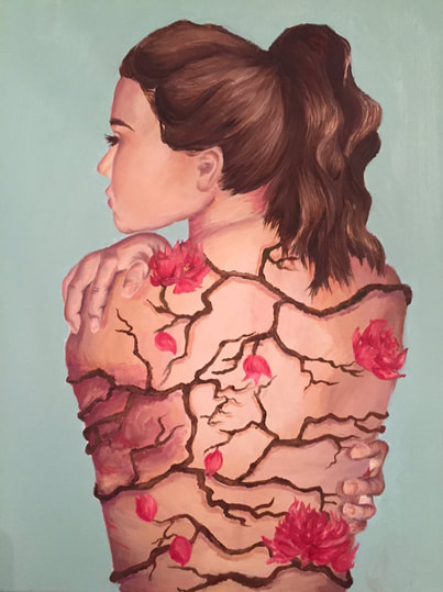 If you know my painting/art style at all, you'll know that I love doing portraits and painting/drawing flowers. So, naturally, when I came up with my concentration theme, I knew that I wanted to do something that incorporated both in it. The rough draft of my "thesis," if you will, is this: My concentration is based around the relationship of people and nature, specifically the idea of being protected by nature, or having aspects of nature representing intimate parts of life. It's a lot, I know, and by the end of the semester I'll (ideally) have a well-written, concise explanation of my theme, but for now, thats the gist of it. This piece, the big number 1, is based on the idea that we all have these "walls" that we put up to protect ourselves from emotional harm. The idea of "breaking down someone's walls" is a pretty cliche metaphor, but I really wanted to expand on that idea a little more, in a less cliche way. So basically, the branches represent a "skeleton" of sorts, that covers the girl in the picture. The flowers on it are a visual representation of the health of the branches, and therefore the girl within. (It all makes sense in my head, just bear with me). I put the bruise to represent some form of emotional trauma, and I put no flowers on that section of the branches to make it seem barren and dead. Then, around the bruise, I put budding flowers to represent the gradual healing and repairing of the "walls." At the outsides of the branches, farthest away from the bruise, there are full-grown flowers, showing the healthy, intact parts. For me, this piece is about the fact that even when we are hurt or going through something difficult, we will always heal and end up stronger than we were before. I think it's one of those pieces that people can interpret for themselves, and the idea that people can get something out of one of my work is really cool to me.
From a more technical standpoint, I think this is one of my best pieces. I still want to go in and add more detail to the flowers, and possibly even add more of them, and the background definitely needs work, but this is still more than I'd imagined in my head. I got to work on my skills with oils, painting flowers, skin, and a profile, and I think I did a pretty good job. There are definitely places I need to work on, such as the hands, which I'm not 100% happy with (when am I ever, though). I also really want to work some more on the hair to add more details and make it look a bit more realistic. I think the whole piece is off to a great start, and COULD be finished, but I feel like if I went in later and added a little bit more detail, it could be something I'm really proud of. This piece was a huge challenge, and totally showed me that I can tackle more interpretive, large-scale pieces. I did realize that I need to work a lot faster and be less of a perfectionist if I'm going to make it out of this semester with twelve pieces, but that will obviously take time. I think it's a really great way to start off my concentration, and I can only hope that I'm as happy with all of my other pieces as I am with this one. |
Archives
May 2018
Categories |
 RSS Feed
