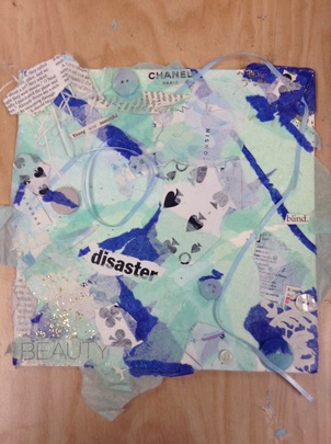
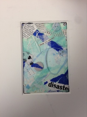
This project had me in a major artist's block. I haven't done abstract projects very often, so this one definitely made me think. Originally, I was thinking about doing a collage that was just a bunch of tissue paper and miscellaneous objects I found in the art room. I didn't think about a meaning behind my work at all. Apparently, my brain thought a message would be good, since the collage ended up being a little bit deep. This actually made me like the work even more.
How do I reflect on my art? For a while at the beginning of this project I had absolutely zero idea what to do. I came up with a color scheme that I liked, and had to really work on planning what to add next. I often took different things like ribbon, feathers, and other objects over to my table and had to look at how they'd look on my artwork. Some things I really liked, like the cards and buttons, but others I decided not to use. I also had to look at the collage in different ways so that I could see different angles and compositions. In the end, I think it was worth it because I made something that I'm proud of. How did I develop art making skills? This is actually the first collage I've ever done, discounting elementary school ones with construction paper and glitter glue. I was really excited (and a bit apprehensive) to do abstract art, since almost everything I've done in high school art has been more concrete, I guess you could say. I learned a lot about how to make interesting compositions, and that you can't just throw some paper together and hope it looks good. It actually took a lot of thought. How did I convey a message? I didn't originally intend to have a message in this abstract artwork. I didn't even realize that abstract art could have deeper meaning. As I was making my collage it suddenly went from some blue tissue paper to a piece that had a theme about beauty. Not my original plan at all. The words I cut out from magazines such as "disaster", "blind", and "beauty" all make you really think. I guess what the message I see when I look at this piece is something about how society is very centered around beauty, and it can make other things seem less important. That being said, I also feel sort of calmed when I look at my artwork, because of all the cool colors and the way it is all tied together. I think that with abstract art the meaning is up to the viewer, everyone sees something different, and that is what I really enjoyed about this project.
0 Comments
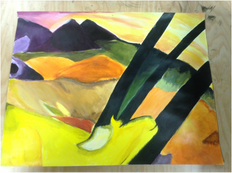 This is my recreation of a segment of "The Yellow Cow" by Franz Marc. It took a while to mix all of the colors to mimic the painting, and some sections could definitely use some more details. Overall, I'm pretty proud of this! 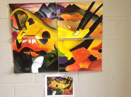 Here's how the full painting looked when all four pieces came together. Clearly some of the colors are a little different, and they aren't exactly aligned, but I still think that it looks alright. 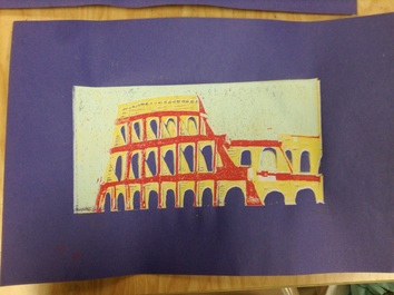 For this project we had to do a multi color print of a famous piece of architecture or one of the wonders of the world. I chose to do the Rome Colosseum because I've always thought it is a beautiful building, and it's such an important piece of history.
How did I develop my art making skills? Before this project the only experience with printmaking was a very poorly done print of a tree. (you can see it in the Art 1 section of my blog for comparison) That project didn't turn out very well, so I was very hesitant going into this project, especially with multiple colors. I definitely surprised myself with this, as I'd somehow managed to make something I'm proud of. A few of my prints weren't very well lined up, but they mostly turned out okay. One thing I am still unhappy with is the details in the building itself. I wish I'd put more lines in the yellow section, since it looks sort of three dimensional and could definitely use more value. How did I create original art? The picture I referenced for this project was one I found on google images, and I thought it had an interesting composition. I knew from the start of the project that I wanted to alter the colors to make it more interesting and different from the real thing. I messed around a lot with the colors to see what would look good together, and ended up finding something I liked. I like the contrasting colors between the windows and the building, and how the yellow "stone" makes the purple windows really POP. How did I take risks? I think that for me personally, this whole project was sort of a risk. The print I made in Art 1 really left me feeling like I was terrible at printmaking, and that was only one color! When Ms.Rossi introduced this project I was definitely dreading it. I had serious artist's block, and took forever coming up with an idea. I ended up choosing one I wasn't totally comfortable with, but I think it paid off a lot in the long run. Another risk I took was attempting to add more details to the building. I would have been fine with simple, flat colors, but I knew I'd never get any better with that attitude. I'm glad I took some risk with this project, because I'm pretty proud of the turnout. 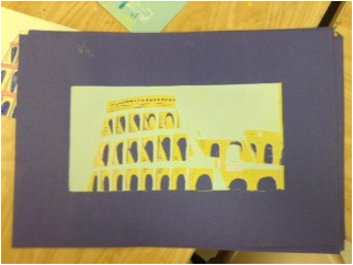 This is my print after he first few colors had already been printed. I was so caught up in the process I completely forgot to take more pictures, but here you can see the blue, yellow and white layered over the dark purple paper. 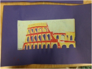 Here is my print after I'd printed the last color to it. I think it turned out really well, but i think the ink could've been more opaque in some sections. |
SOME info for youAll of this is art from my second art class, which I took the first semester of my sophomore year in high school. This was the year that I realized, "Hey, maybe I'm actually sort of okay at this." After I took Art Two I had pretty much decided in my mind that I wanted to go further with art and explore my abilities. Archives
January 2016
Categories |
 RSS Feed
