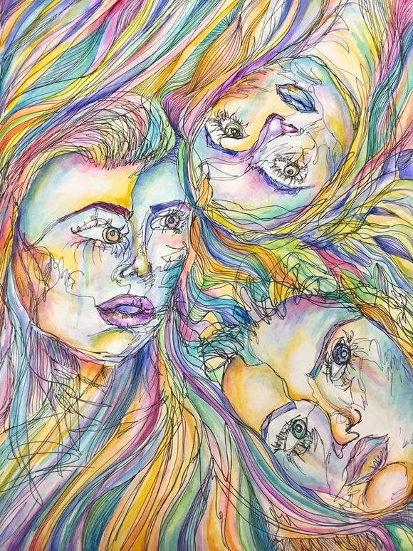
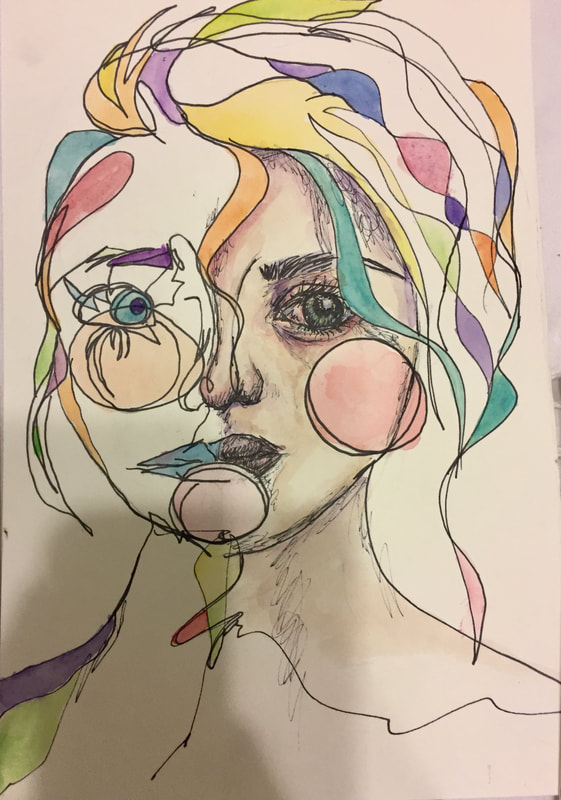
 When I started this piece, I had no idea that it would turn out this way. I started with a few sketches to practice my blind contour drawings(see previous post) and I found that I really enjoyed how loosely I could draw and paint with them. For this piece, I originally wanted to make it a mixed-media collage sort of thing with the paintings that I had originally done, but I wasn't sure how to make it work and still look good. So, I decided to do three new contour sketches and combine them into one big piece. I took all of the colors that I used in my original sketches from over the summer and tried my best to incorporate those into my piece. I tried to make it a little bit looser and more free flowing than the original three sketches. After doing such a realistic and structured painting for my last project I really wanted to do something more loose, and I think it turned out way better than I'd anticipated.
I really like the colors that I used in this piece. I think that they all go really well together and contrast nicely with the serious faces I used for the people. One of the things I really wanted to do with my original pieces was to juxtapose the bright, happy colors with more moody and emotional faces. I think I achieved this a little better with my first few sketches, but I'm still really proud of the faces in this piece. I like the freedom of doing "semi-blind" contour sketches because I don't have to think too much about the perfect proportions or blending the skin tones just right. Everything was up to my own creative liberty, and it was really nice to be able to do something and just enjoy the process. That being said, one thing I would do differently if I redid this piece is that I would add in the areas of realism to some parts of the faces. I feel like they would convey a bit more emotion into the piece and make it more interesting to look at. The whole thing is very even, and I wish I had made something that stands out or acts as a central focal point, something to really draw your eyes in. I do love the intensity of the colors, and the pen work, but I feel like there is still something missing from it. All in all, this piece was definitely good for me to loosen up my creative juices and get me back into a mindset where I can come up with more ideas for future projects. As someone who tends to find herself in a perpetual state of artists block I think it was incredibly helpful to take a brief break from the realism and do something more abstract. I definitely feel now like abstraction is a technique I should work more on and incorporate into my work more often, and after doing this piece I'm not afraid of straying from realistic paintings.
0 Comments
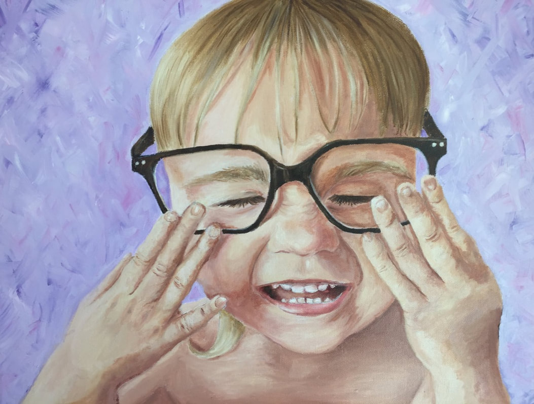 When I went into Art IV for the second time, I was a little worried about redoing all of the projects that I had already done before. Thankfully, after the reflection project, I was told that I didn't need to be doing the same projects twice, for the sake of my portfolio and for my sanity. So when my teacher asked me what kind of project I wanted to do, I naturally picked the project that would stress me out the most. I had this amazing picture that I took of my cousin at the beach, and I've been wanting to paint it for forever, and I finally got the chance. Since acrylic paints are the bane of my existence, choosing oil paints was easy. Not as easy: painting the hands and the mouth. Even though I loved the picture, I chose an idea with my two least favorite parts of the human body to paint: hands and an open, smiling mouth. But nevertheless, I was determined to do it. And do it I did. I am actually incredibly pleased with the result of this painting. It took me was less time than I'd anticipated at first, and I think it's the best portrait I've ever done. Knowing that I did this portrait makes the idea of future ones WAY less intimidating.
If there's one thing that I'm really proud of on this piece, its the emotion I showed in the face, and that NOSE. I usually think that I'm pretty bad at painting noses, but I actually think that the nose in this portrait turned out really great, and I'm super proud of it. It was a little daunting at first to look at the reference picture and attempt to create the same emotion that I feel in that photo. On the day the picture was taken, my cousin was wearing my glasses, which are clearly too big for her, and the joy on her face was obvious. I really wanted to try and capture that in my painting. Since painting mouths has always been something that I sort of dread doing, I was really impressed with myself and how well it ended up turning out, and I think that the mouth was a key aspect of making the emotion really come through in the painting. Another thing that I was super apprehensive about going into this piece was the fact that I had to paint hands. Painting hands is one of my least favorite things to do, but alas, they were a pretty substantial part of this piece. I'm pretty proud of how they ended up turning out, but I know that there is still a lot of room for improvement in the hand-painting department. This is hands-down the best portrait I've ever done. I'm SO impressed with myself. I never expected to make a painting this realistic before and I think I'm still a little bit in shock that I did this. I can't wait to paint more challenging portraits and see what I can do; knowing that I've accomplished this painting has definitely made me feel a lot more confident about portraits in the future. 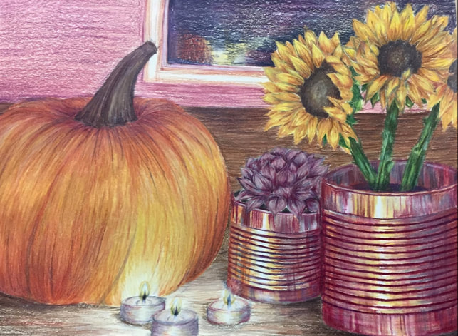 Let me just start by saying that I put wayyyyy too much pressure on myself at the start of this project. My last reflection project is one of my favorite things I've ever created, and I really wanted to make my second piece just as good, if not better. This was definitely the wrong mindset, but I'm basically a pro at making myself way more stressed out than I need to be. That being said, I knew I wanted this piece to be very autumnal, as anyone who knows me knows that I am absolutely in love with autumn. I figured that if my piece was autumnal, it would be a really good representation of myself. I added some literal reflective qualities with the tea lights, tin cans, and window, as well as a little bit in the pumpkin.
My favorite part of this piece is hands down the tin cans. I was originally really afraid to do these, but I think they are what makes this piece stand out to me. I love the colors I used, and how I didn't just go for the classic grey metal cans. The orange I incorporated into the cans tied in with the pumpkin, and the yellows really tie in the sunflowers. I am also really proud of the flowers. Sunflowers are my favorite flowers and they are also very autumnal, so I felt like they were perfect for this piece. I love how I used different oranges and yellows to achieve the perfect sunflower yellow, and I think the shading in the petals really makes them look like they are 3D. Pretty much every part of this piece I like except for the background. I was totally rushed for the background, and its very obvious. I'm definitely going to go in and fix it since I hate how it currently looks, but for now I guess it is okay. I was really struggling to figure out the reflections in the window, and because I was so rushed it looks unrealistic and unfinished. I think that if I just go in and spend some time working on it I will definitely improve how it looks and feel much better about it. This piece was a really fun, low-stress piece to start my senior year of art off with, and it made me genuinely really excited to see what else I can create this year. I think that pieces like this that challenge you technically as well as make you think about a deeper meaning are really important, especially for someone like me who is constantly in a state of artists-block. This definitely got my creative juices flowing, and I feel like I can (hopefully) keep the momentum going throughout the semester. If there's one major thing that I can take away from this piece it's that I vastly underestimated just how many different colors are in a single pumpkin. Hint: they are NOT just orange. |
Archives
March 2018
Categories |
 RSS Feed
