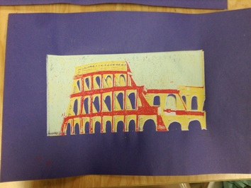
 For this project we had to do a multi color print of a famous piece of architecture or one of the wonders of the world. I chose to do the Rome Colosseum because I've always thought it is a beautiful building, and it's such an important piece of history.
How did I develop my art making skills? Before this project the only experience with printmaking was a very poorly done print of a tree. (you can see it in the Art 1 section of my blog for comparison) That project didn't turn out very well, so I was very hesitant going into this project, especially with multiple colors. I definitely surprised myself with this, as I'd somehow managed to make something I'm proud of. A few of my prints weren't very well lined up, but they mostly turned out okay. One thing I am still unhappy with is the details in the building itself. I wish I'd put more lines in the yellow section, since it looks sort of three dimensional and could definitely use more value. How did I create original art? The picture I referenced for this project was one I found on google images, and I thought it had an interesting composition. I knew from the start of the project that I wanted to alter the colors to make it more interesting and different from the real thing. I messed around a lot with the colors to see what would look good together, and ended up finding something I liked. I like the contrasting colors between the windows and the building, and how the yellow "stone" makes the purple windows really POP. How did I take risks? I think that for me personally, this whole project was sort of a risk. The print I made in Art 1 really left me feeling like I was terrible at printmaking, and that was only one color! When Ms.Rossi introduced this project I was definitely dreading it. I had serious artist's block, and took forever coming up with an idea. I ended up choosing one I wasn't totally comfortable with, but I think it paid off a lot in the long run. Another risk I took was attempting to add more details to the building. I would have been fine with simple, flat colors, but I knew I'd never get any better with that attitude. I'm glad I took some risk with this project, because I'm pretty proud of the turnout.
0 Comments
Leave a Reply. |
SOME info for youAll of this is art from my second art class, which I took the first semester of my sophomore year in high school. This was the year that I realized, "Hey, maybe I'm actually sort of okay at this." After I took Art Two I had pretty much decided in my mind that I wanted to go further with art and explore my abilities. Archives
January 2016
Categories |
 RSS Feed
