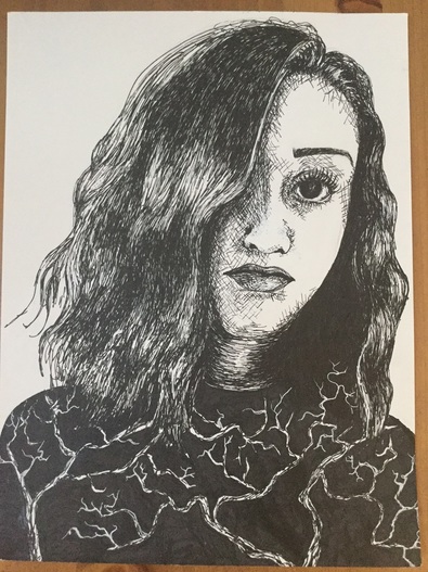
 Here it is. The dreaded self-portrait. For the longest time the words "self-portrait" instilled a little bit of panic in me, so I was not excited to start this project at all. Surprisingly, however, I am super pleased with the way this turned out. It's the first time I've done a self portrait, and also the first time I've done a portrait with pen & ink before, so I definitely learned more about myself as an artist through this piece. But okay, let's talk about pen and ink. I personally love the way pieces done with ink look, and how it gives pieces so much emotion, but they stress. me. out. The hardest thing to get past when working with pen is the fear of messing up. Since you can't erase pen, it can be SO easy to just freak out and never want to use them, but I think that once you get past that fear they can be so fun to work with. I messed up a few times myself during this project, but I used white ink to fix them.
The first challenge I faced right out of the gate with this portrait was getting used to the pens. I hadn't used them since Art 2, so remembering how to shade and get a range of values was really important, especially with faces. I decided to use cross-hatching for the majority of the shading on the face because I liked the sort of raw, sketchy effect they gave. I also had to be really careful where I placed each line, because having one that is out of place could throw the whole piece off. I learned this the hard way when I accidentally extended the shading on the nose a bit too far. This resulted in a super weird, almost disgusted expression. Definitely NOT what I was going for. I went back in with some white ink to cover it up, and I think that helped a ton. Keeping highlights with pen and ink is difficult because you have to know exactly where you want to put your ink, and where to keep it away from. This was especially hard in the eye of my portrait because I have pretty dark, almost black eyes. I did the eye in stages so that I wouldn't accidentally cover up what little light there was in them. I had to be careful with the undereye area as well. I was going for a tired, sort of broody effect with this picture, so I needed some exaggerated shadows under the eyes, but if I added too much it would end up looking like I'd gotten a black eye in a fight or hadn't slept in 5 years. For my body/ shirt, I ran into a little dilemma because in my reference picture it was solid black. I knew I didn't want to make the whole thing black, especially since the body takes up a pretty large section of the piece. I chose to put trees because I really love nature and the outdoors, and I thought that would add something extra to the "self-portrait" theme. I also wanted to do something a little bit more unconventional, since my art tends to be much more literal. Something I want to work on more in my future pieces is thinking more outside the box and trying not to make my pieces so normal, if that makes sense. This whole piece was just a huge balancing act, and I feel really good about how it turned out. I definitely want to keep working on my portrait skills, since I think the ability to draw people realistically is not only a good skill to have as an artist, but something that I personally have a lot of interest in. I also hope to do more pen and ink pieces in the future, because it's one of my favorite mediums.
0 Comments
Leave a Reply. |
A Little InfoThis page is all of my art from Art Four, which I took my junior year of high school. The main goal of this class was to begin collecting pieces that I can potentially add to my AP Portfolio at the end of Senior year. During this class I created some of my favorite pieces, and also one of my least favorite (I'm looking at you, adirondack chair painting). I'll be retaking this class in the fall of senior year to add more pieces to learn and grow even more, and create more potential portfolio pieces. Archives
January 2017
Categories |
 RSS Feed
